Typography
The BlackRock brands use a custom-designed typeface, BLK Fort. We use it for all text layouts in both print and digital applications. In the digital space, we have set rules for weight usage and how text is scaled depending on device/breakpoints, which are detailed out below.
Our international language font is Noto Sans. We recommend using the following weights in Noto Sans for all international languages (other than Latin) — Noto Sans Condensed Light, Noto Sans Regular, Noto Sans Bold, and Noto Sans Black.
Type alignment
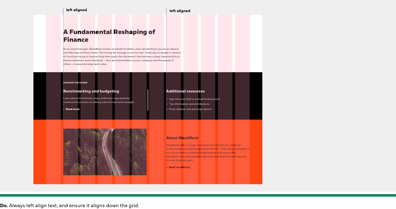
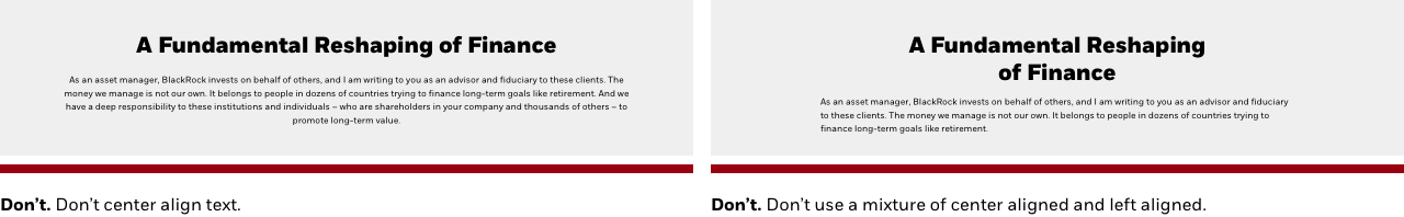
For all experiences across BlackRock brands, all headline, subhead, and body copy is left aligned. This improves legibility, and maintains a consistent experience across channels.
Line length
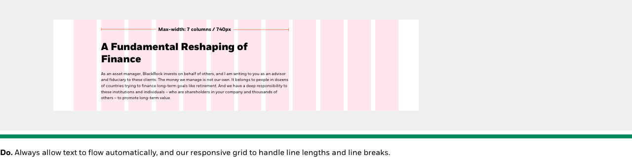
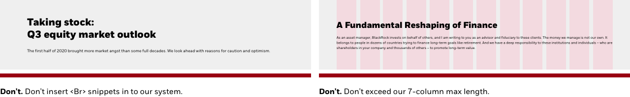
Setting max-width headline/body text limits aids in legibility for our users, particularly those with reading or visual accessibility needs. At BlackRock, our maximum line widths are pre-set (per component) using our responsive grid column structure, and automatically adjusts as the screens get smaller.
Note: Never insert <Br> into our code to achieve a visual break in headlines/body copy, as it causes accessibility issues with screen readers, visual issues & inconsistencies across breakpoints.
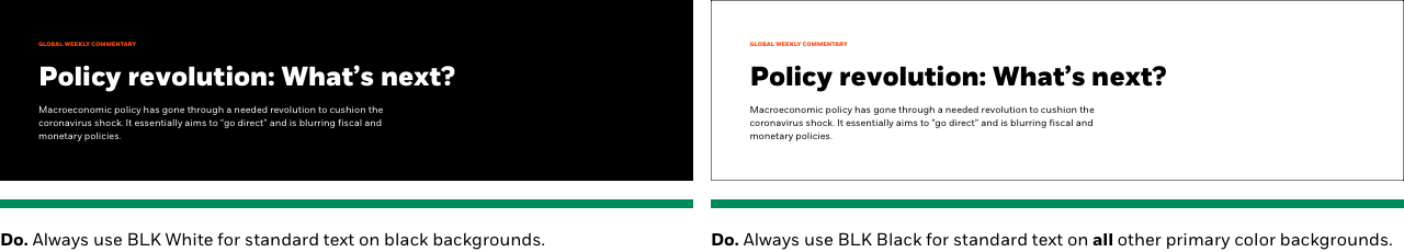
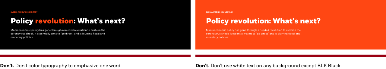
Color & combinations
Typography should always be set to black or white, depending on the background color. There are very few instances where we use color to call out certain elements and special-case needs (i.e. eyebrows).
As a global firm, we have an obligation to ensure all content is accessible to every user, including those with low vision or color deficiencies. We must ensure the combinations of text and their background colors do not fall below the WCAG recommended threshold ratio of 4.5:1 for all text.
Capitalization
- Always write body copy (body text) using sentence case (capitalize the first letter only, followed by all lowercase letters), with the exception of proper nouns (the name of a person, place or organization).
- Use capital letters for proper nouns: “Larry Fink”, “Oregon”, “the Bank of England” (“the bank” on subsequent mention).
- Don’t capitalize common nouns: “the bank”, “the marketing team”, “our director”.
- Eyebrows are always displayed* in all caps.
Note: *Regardless of the visual style of the headline, always write copy into the CMS using sentence case.
Font Icons
Functional, or system icons represent very specific user interface actions. They should depict a clickable action or command - download, share, print, search, etc.
At BlackRock, we leverage the Font Awesome 5 Pro font toolkit. Font Awesome provides scalable vector icons that can instantly be customized without losing any of the details and nuances.
Font Awesome is loaded in our CSS, so there is nothing more than giving the icon unicode to developers to implement it.
Breakpoints & typography
The BlackRock typographic scale provides a range of font sizes, weights and styles to create hierarchical structured content. We aim to keep these styles to the minimum that work across our ecosystem.
Responsive typography scale
To give the best possible reading experience across devices, certain styles in our typographic scale adjusts across our breakpoints. Sizes start at breakpoint XS, where a change happens at each of the larger breakpoints, we define the specification.
Note: This is our current text size matrix that is being used across our component system. There may be additional sizes added or adjusted depending on future work needs.
| XS | S | M | L | XL |
|---|---|---|---|---|
| 0-599 | 600-767 | 768-1023 | 1024-1439 | 1440-1920 |
| Breakpoints: | XS | M | L | XL |
|---|---|---|---|---|
| Font Size: | 40px | 56px | 72px | 80px |
| Line Height: | 48px | 64px | 80px | 88px |
| Breakpoints: | XS | M | L | XL |
|---|---|---|---|---|
| Font Size: | 40px | 40px | 48px | 56px |
| Line Height: | 48px | 48px | 56px | 64px |
| Breakpoints: | XS | L |
|---|---|---|
| Font Size: | 32px | 40px |
| Line Height: | 40px | 48px |
| Breakpoints: | XS | L |
|---|---|---|
| Font Size: | 24px | 32px |
| Line Height: | 32px | 40px |
| Breakpoints: | XS |
|---|---|
| Font Size: | 24px |
| Line Height: | 32px |
| Breakpoints: | XS | XL |
|---|---|---|
| Font Size: | 24px | 32px |
| Line Height: | 32px | 40px |
| Breakpoints: | XS |
|---|---|
| Font Size: | 24px |
| Line Height: | 32px |
| Breakpoints: | XS |
|---|---|
| Font Size: | 20px |
| Line Height: | 28px |
| Breakpoints: | XS |
|---|---|
| Font Size: | 12px |
| Line Height: | 20px |
| Breakpoints: | XS |
|---|---|
| Font Size: | 20px |
| Line Height: | 28px |
| Breakpoints: | XS |
|---|---|
| Font Size: | 20px |
| Line Height: | 28px |
| Breakpoints: | XS |
|---|---|
| Font Size: | 16px |
| Line Height: | 24px |
| Breakpoints: | XS |
|---|---|
| Font Size: | 16px |
| Line Height: | 24px |
| Breakpoints: | XS |
|---|---|
| Font Size: | 12px |
| Line Height: | 16px |
| Breakpoints: | XS |
|---|---|
| Font Size: | 12px |
| Line Height: | 16px |
| Breakpoints: | XS |
|---|---|
| Font Size: | 16px |
| Line Height: | 20px |