Hero CTA banner
The Hero CTA banner is used to define a major section or high-traffic webpage; i.e. a campaign landing page, and should help set up diverse and related content for visitors to explore. We recommend using this banner on most L1 pages, which then links to lower-level pages.
Engage users by keeping headlines short, descriptive, and by creating a very clear call-to-action that directs them to take the next step.
If the purpose of your webpage is to tell one unifying message in a seamless flow, i.e. “Larry’s letter” as the hero, then a related content piece on sustainability, you can use this component multiple times on a page, in a stack of 3–4 for example. If doing so, please take care to alternate orientation to show variability in the content.
Designing for iShares? View the iShares Design System for their version of this component.
Image appearances
We have multiple image layout options to choose from, all with a right-side or left-side image orientation:
- Full-height — image extends to the top/bottom of the component
- Offset — image locks to the bottom of the component, with top-padding
- Border — image has top/bottom 40px inset border
For any of these layout options, you have the choice of where the image gets cropped from across different breakpoints; center, left or right side of the image container. This works for either right-side or left-side image orientation. See “Image placement & cropping guide” for more details.
PRO TIP: Always default to image-right as the first banner on the page, and alternate orientations if your content needs require stacking more banners below.

Full-height appearance

Offset appearance

Border appearance
Rules and recommendations

Hero CTA - Image |
|---|
| A: Backgrounds: BLK_Black, BLK_White with optional top/bottom border, BLK_Orange, BLK_Yellow B: Eyebrow (optional): • Character count: ~35* • Can be used as the H1, however this should be the exception and only used in very specific cases when the title does not match the page content. C: Headline: • Character count before text gets cut off: ~70* • The headline will default to be an H1. If you are not using this banner at the top of the page, please specify whether the headline needs to be an H2 or H3 D: Body (optional): • Character count before text gets cut off: ~350* E: CTA (optional): • CTA can be either a primary button or a tertiary link • Keep these "digital" friendly; i.e. short descriptors F: Image: • Image dimensions: Graphics are cut wider to accommodate responsive layouts • Full-height appearance: 860x600px graphic (JPG/PNG) • Offset appearance: 860x448px graphic (JPG/PNG) • Border appearance: 860x520px graphic (JPG/PNG) • Image alignment: left or right • See “Image and cropping guides” section for detailed instructions • Use the image resize tool for assitance with scaling and optimizing images • All image assets must be optimized for the web: <300kb |
| *NOTE: Due to varying alphabets and character widths, please ensure your publisher tests this prior to release |
Alternate variations
To help you visualize different possible layouts and background colors, we stacked a few components together to give you a more clear understanding of how this could look.

Where we stand

Where we stand
No image appearances
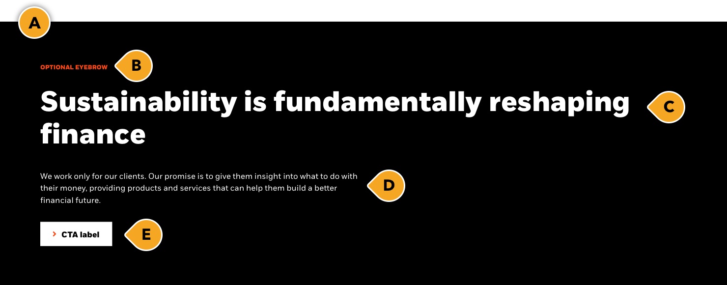
If your content requires a more “standard” style banner on a lower-level web page, but also allows for introductory copy and a CTA option, then choose this appearance. It has all the options as our “image” appearance, but without the image.
Note: We do not suggest using the “no image” appearance more than one time per web page. It should always be placed at the top of the page, below the main navigation menu.
No image appearance headline
Rules and recommendations

Hero CTA - No image |
|---|
| A: Backgrounds: BLK_Black, BLK_White with optional top/bottom border, BLK_Orange, BLK_Yellow B: Eyebrow (optional): • Character count: ~35* • Can be used as the H1, however this should be the exception and only used in very specific cases when the title does not match the page content. C: Headline: • Character count before text gets cut off: ~70* • The headline will default to be an H1. If you are not using this banner at the top of the page, please specify whether the headline needs to be an H2 or H3 D: Body (optional): • Character count before text gets cut off: ~350* E: CTA (optional): • CTA can be either a primary button or a tertiary link • Keep these "digital" friendly; i.e. short descriptors |
| *NOTE: Due to varying alphabets and character widths, please ensure your publisher tests this prior to release |
Alternate variations
To help you visualize different possible layouts and background colors, we stacked a few components together to give you a more clear understanding of how this could look.
Helping people build stability today for a more resilient future
Helping people build stability today for a more resilient future