Multi-column teaser
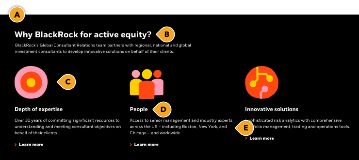
The multi-column teaser component can be used to highlight product benefits, topics, themes, or other related content in sets of 2, 3, or 4. It is recommended to pair it with one of our custom pictograms to help bring the topic to life. Since our pictograms must only be placed over a black or white background, those or the only two colors you should use for this appearance.
PRO TIP: Use the large headline appearance if you are using this to introducing a new content section to your page; think of it as your H2. If this is used as support for an established section, use the “medium” size headline (H3).
Designing for iShares? View the iShares Design System for their version of this component.
Graphic placement
Any graphic being pulled in to the component will be locked to the top left of the container. Pictograms are automatically scaled and do not need any special instructions for publishing. Just pick from our library of custom pictograms and let your publisher know the name of the graphic (i.e. “BLK_icn_fees_tag”). If you are using anything other than a pictogram, you must provide the graphic as an .svg or .png asset, sized to the correct specs dictated below.

Rules and recommendations

| Mandatory |
| A: Pictogram backgrounds: BLK_Black, BLK_White with optional top/bottom border • If not using pictograms (i.e. no graphics), we provide additional background colors: BLK_Orange, BLK_Yellow, BLK_Pink |
| Optional |
| B: Main headline + intro: • Headline character count: ~70* • Large (40px Extrabold) = H2 — or — Medium (32px Bold) = H3 headline size option • PRO TIP: Use the large headline appearance if you are using this to introducing a new content section to your page. If this is used as support for an established section, use the “medium” size headline. • Intro blurb character count: ~350* • Can have the headline without the intro blurb (or vice-versa) C: Pictograms / graphics: • Pull from our custom library. No need to resize or provide graphic, just provide the graphic name to your publisher • Black or white background only when using a pictogram • Asset dimension (if supplying yourself): 125x125px graphic (SVG/PNG). Only “large” pictogram option for this appearance • Only use transparent formats for use across either background color (BLK_Black, BLK_White) • Do not use photography in this appearance; pictograms or similar graphical elements only (read Iconography guidelines) D: Topic headlines • Keep headlines clear and consice • Character count: automatically truncates ~60* E: Topic description + CTA: • Character count: automatically truncates ~175* • CTA text link only, no button in this appearance. Keep these "digital" friendly; i.e. short descriptors |
| *NOTE: Due to varying alphabets and character widths, please ensure your publisher tests this prior to release |
Pictogram appearances
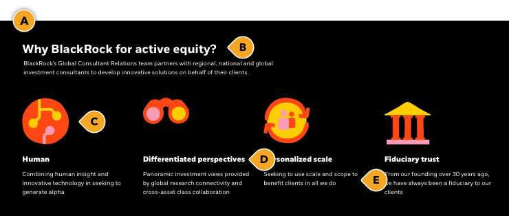
In both our 3-up & 4-up variations, there is the option to use a “small” or “large” pictogram appearance. When stacking multiple rows of this component, we feel it’s best to use the “small” appearance to not overwhelm the page visually. You can also use the “small” appearance as a more subtle option to help lighten the look of your page.
Graphic placement
Any graphic (or size appearance) being pulled in to the component will be locked to the top left of the container. Pictograms are automatically scaled and do not need any special instructions for publishing. Just pick from our library of custom pictograms and let your publisher know the name of the graphic (i.e. “BLK_icn_fees_tag”). If you are using anything other than a pictogram, you must provide the graphic as an .svg or .png asset, sized to the correct specs dictated above.

Rules and recommendations

| Mandatory |
| A: Pictogram backgrounds: BLK_Black, BLK_White with optional top/bottom border • If not using pictograms (i.e. no graphics), we provide additional background colors: BLK_Neutral, BLK_Orange, BLK_Yellow, BLK_Pink |
| Optional |
| B: Main headline + intro: • Headline character count: ~70* • Large (40px Extrabold) = H2 — or — Medium (32px Bold) = H3 headline size option • PRO TIP: Use the large headline appearance if you are using this to introducing a new content section to your page. If this is used as support for an established section, use the “medium” size headline. • Intro blurb character count: ~350* • Can have the headline without the intro blurb (or vice-versa) C: Pictograms / graphics: • Pull from our custom library. No need to resize or provide graphic, just provide the graphic name to your publisher • Black or white background only when using a pictogram • Asset dimension (if supplying yourself): • Small appearance: 72x72px graphic (SVG/PNG) • Large appearance: 125x125px graphic (SVG/PNG) • Only use transparent formats for use across either background color (BLK_Black, BLK_White) • Do not use photography in this appearance; pictograms or similar graphical elements only (read Iconography guidelines) D: Topic headlines • Keep headlines clear and consice • Character count: automatically truncates ~60* E: Topic description + CTA: • Character count: automatically truncates ~175* • CTA text link only, no button in this appearance. Keep these "digital" friendly; i.e. short descriptors |
| *NOTE: Due to varying alphabets and character widths, please ensure your publisher tests this prior to release |
Alternate variations
If you are using this component for another purpose which does not require a pictogram or graphic, we offer additional color variations that can be pulled in. Below are some examples to give you a more clear understanding of how this could look.
Pictogram appearances
In both our 3-up & 4-up variations, there is the option to use a “small” or “large” pictogram appearance. When stacking multiple rows of this component, we feel it’s best to use the “small” appearance to not overwhelm the page visually. You can also use the “small” appearance as a more subtle option to help lighten the look of your page.
Alternate layout
All of our components have the ability to stack vertically as many times as your needs require. To help you visualize different layouts, we stacked two 2-up variations together to give you a more clear understanding of how this could look.
Graphic placement
Any graphic (or size appearance) being pulled in to the component will be locked to the top left of the container. Pictograms are automatically scaled and do not need any special instructions for publishing. Just pick from our library of custom pictograms and let your publisher know the name of the graphic (i.e. “BLK_icn_fees_tag”). If you are using anything other than a pictogram, you must provide the graphic as an .svg or .png asset, sized to the correct specs dictated above.

Rules and recommendations

| Mandatory |
| A: Pictogram backgrounds: BLK_Black, BLK_White with optional top/bottom border • If not using pictograms (i.e. no graphics), we provide additional background colors: BLK_Neutral, BLK_Orange, BLK_Yellow, BLK_Pink |
| Optional |
| B: Main headline + intro: • Headline character count: ~70* • Large (40px Extrabold) = H2 — or — Medium (32px Bold) = H3 headline size option • PRO TIP: Use the large headline appearance if you are using this to introducing a new content section to your page. If this is used as support for an established section, use the “medium” size headline. • Intro blurb character count: ~350* • Can have the headline without the intro blurb (or vice-versa) C: Pictograms / graphics: • Pull from our custom library. No need to resize or provide graphic, just provide the graphic name to your publisher • Black or white background only when using a pictogram • Asset dimension (if supplying yourself): • Small appearance: 72x72px graphic (SVG/PNG) • Large appearance: 125x125px graphic (SVG/PNG) • Only use transparent formats for use across either background color (BLK_Black, BLK_White) • Do not use photography in this appearance; pictograms or similar graphical elements only (read Iconography guidelines) D: Topic headlines • Keep headlines clear and consice • Character count: automatically truncates ~60* E: Topic description + CTA: • Character count: automatically truncates ~175* • CTA text link only, no button in this appearance. Keep these "digital" friendly; i.e. short descriptors |
| *NOTE: Due to varying alphabets and character widths, please ensure your publisher tests this prior to release |
Link lists
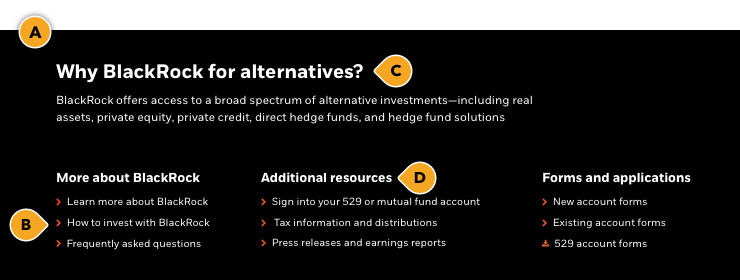
Baked in to this component is the flexibility to add a multi-column link list appearance. This appearance can only be used in a 3 or 4-column layout, with or without a pictogram or graphic. If you decide to use a pictogram, you must only use a black or white background.
PRO TIP: Use this appearance for resources, forms, quick links; anything that doesn't need more context than the actual link.
If you are trying to achieve a 2-column layout with links, try our Related content component.
Rules and recommendations

| Mandatory |
| A: Pictogram backgrounds: BLK_Black, BLK_White with optional top/bottom border • If not using pictograms (i.e. no graphics), we provide additional background colors: BLK_Neutral, BLK_Orange, BLK_Yellow, BLK_Pink B: Link list: • Keep these "digital" friendly; i.e. short descriptors • 3-column or 4-column layout • 5 links max per topic/section • Keep links clear and concise • Link icon can be chevron |
| Optional |
| C: Main headline + intro: • Headline character count: ~70* • Large (40px Extrabold) = H2 — or — Medium (32px Bold) = H3 headline size option • PRO TIP: Use the large headline appearance if you are using this to introducing a new content section to your page. If this is used as support for an established section, use the “medium” size headline. • Intro blurb character count: ~350* • Can have the headline without the intro blurb (or vice-versa) D: Topic headlines • Keep headlines clear and consice • Character count: automatically truncates ~60* *Pictograms / graphics (not shown): • Black or white background only when using a pictogram • Pull from our custom library. No need to resize or provide graphic, just provide the graphic name to your publisher • Asset dimension (if supplying yourself): • Small appearance: 72x72px graphic (SVG/PNG) • Large appearance: 125x125px graphic (SVG/PNG) • Only use transparent formats for use across either background color (BLK_Black, BLK_White) • Do not use photography in this appearance; pictograms or similar graphical elements only (read Iconography guidelines) |
| *NOTE: Due to varying alphabets and character widths, please ensure your publisher tests this prior to release |
Alternate variations
To help you visualize different possible layouts and background colors, we laid out a few variations to give you a more clear understanding of how this could look.
