CTA with image
The CTA w/ image component is meant to highlight and link out to related subjects, products, services, or applications. There are three appearances: small, medium, and large, and all can be used anywhere on the page (below the banner). All appearances can be customized with different styling options, and stacked multiple times on a page.
Publishing? View the DCR guidebook for detailed instructions.
Small appearance
The small appearance version should always display a communicative icon (pictogram) and sits lower in the page hierarchy, as a level 3 component. Use this option when the information contained within is of lesser importance to the rest of the page content.
The left aligned option aligns the pictogram to our paragraph content block for visual continuity, or you can right align the pictogram so the copy block aligns perfectly to the paragraph copy above/below it.
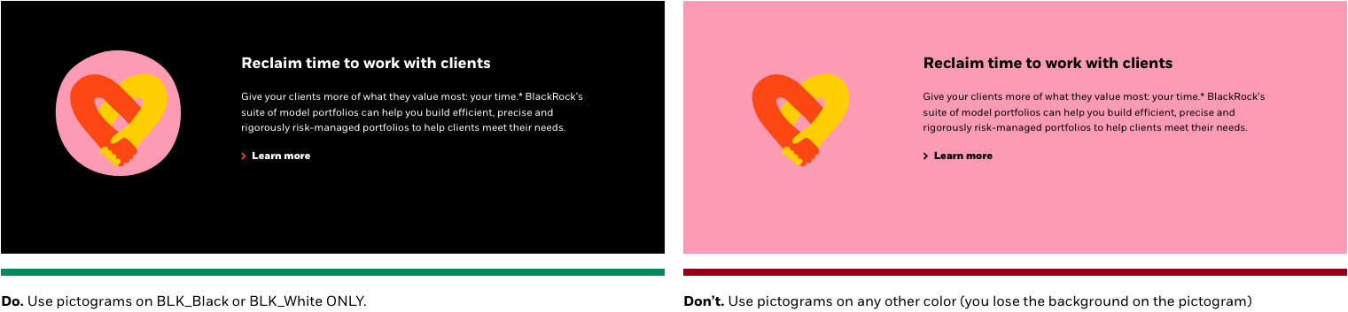
Since our pictograms must only be placed over a black or white background, those or the only two colors you should use for this appearance.
PRO TIP: When stacking this component, stagger the orientation to help create a good visual flow. Also consider the color usage rules and content in terms of the entire page layout.
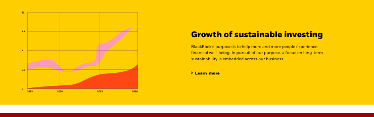
Sustainability is reshaping finance
Sustainability is reshaping finance
Rules and recommendations

| Small appearance |
|---|
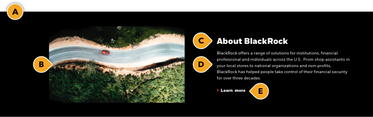
| A: Pictogram backgrounds: BLK_Black, BLK_White with optional top/bottom border • If not using pictograms (i.e. no graphics), we provide additional background colors: BLK_Neutral, BLK_Orange, BLK_Yellow, BLK_Pink B: Pictograms / graphics: • Pull from our custom library. No need to resize or provide graphic, just provide the graphic name to your publisher • Black or white background only when using a pictogram • Asset dimension (if supplying yourself): 200x200px graphic (SVG/PNG) • Only use transparent formats for use across any background color • Do not use photography in this appearance; pictograms or similar graphical elements only (read Iconography guidelines) • Asset alignment: left or right C: Headline: • Character count: ~70* • Hard coded character limit D: Body (optional): • Character count: ~350* • Hard coded character limit E: CTA (optional): • Can be either a button or a text link • Keep these "digital" friendly; i.e. short descriptors |
| *NOTE: Due to varying alphabets and character widths, please ensure your publisher tests this prior to release |
Do’s & Do nots
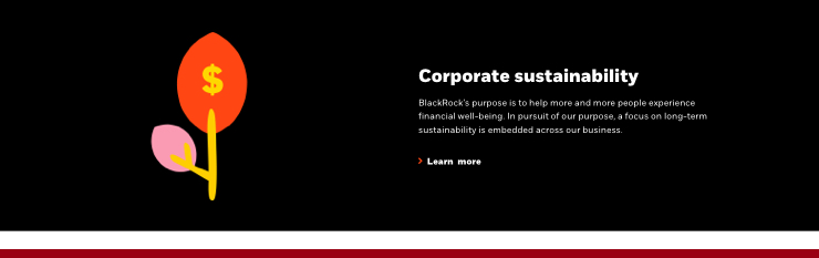
As stated above, do not use colored backgrounds for use with pictograms in this component. Since BlackRock pictograms always contain three brand colors: orange, yellow and pink, they are never to be used on any background color other than black or white.
Medium appearance
The medium appearance is a level 2 component, so it can be used at any point on your page (below your banner). Use this option when the information contained needs more emphasis than our small appearance.
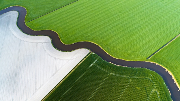
It allows for the use of photography to help reinforce a related topic or theme. These images should always be used with purpose and never solely for aesthetics, supporting and amplify the idea being communicated. Never use a pictogram in this appearance.
The left aligned option aligns the photograph to our paragraph content block for visual continuity, or you can right align the photograph so the copy block aligns perfectly to the paragraph copy above/below it.
PRO TIP: When stacking this component, stagger the orientation to help create a good visual flow. Also consider the color usage rules and content in terms of the entire page layout.
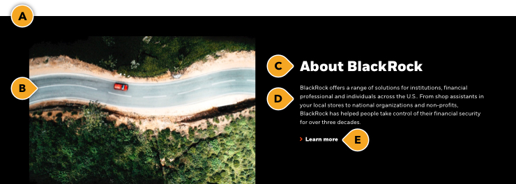
About BlackRock

Where we stand
Rules and recommendations
| Medium appearance |
|---|
| A: Background: BLK_Black, BLK_White with optional top/bottom border, BLK_Neutral, BLK_Orange, BLK_Yellow, BLK_Pink B: Image: • Size: 624x350px (JPG/PNG) to accommodate responsive layouts • Photography only - Do not use pictograms in this appearance • Asset alignment: left or right • Image automatically scales and maintains aspect ratio • All image assets must be optimized for the web: <300kb C: Headline: • Character count: ~70* • Hard coded character limit D: Body: • Character count: ~350* • Hard coded character limit E: CTA (optional): • Can be either a button or a text link • Keep these "digital" friendly; i.e. short descriptors |
| *NOTE: Due to varying alphabets and character widths, please ensure your publisher tests this prior to release |
Do nots
As stated above, do not use pictograms in this component. Also be aware when using Data visualizations on any color backgrounds other than black or white, as they always contain our core brand colors: orange, yellow and pink.
Don’t. Use pictograms in our medium appearance.
Don’t. Use data visualization on any color backgrounds other than black or white .
Alternate variations
To help you visualize different possible layouts and background colors, we stacked a few components together to give you a more clear understanding of how this could look.
About BlackRock
Where we stand

The BlackRock Savings Summit

Large appearance
The large appearance is a level 1 component, so it can be used at any point on your page (below your banner). Use this option when the information contained needs high emphasis.
It allows for the use of photography or similar graphic element to help reinforce a related topic, theme, or showcase an application. These images should always be used with purpose and never solely for aesthetics, supporting and amplify the idea being communicated. Never use a pictogram in this appearance.
PRO TIP: When stacking this component, stagger the orientation to help create a good visual flow. Also consider the color usage rules and content in terms of the entire page layout.
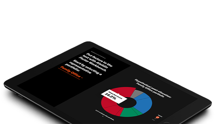
About BlackRock
Our response to COVID-19
Rules and recommendations
| Large appearance |
|---|
| A: Background: BLK_Black, BLK_White with optional top/bottom border, BLK_Neutral, BLK_Orange, BLK_Yellow, BLK_Pink B: Image: • Size: 752x423px: (JPG/PNG/SVG) • Do not use pictograms in this appearance • Asset alignment: left or right • All image assets must be optimized for the web: <300kb C: Headline: • Character count: ~70* • Hard coded character limit D: Body: • Character count: ~350* • Hard coded character limit E: CTA (optional): • Can be either a button or a text link • Keep these "digital" friendly; i.e. short descriptors |
| *NOTE: Due to varying alphabets and character widths, please ensure your publisher tests this prior to release |
Do nots
As stated above, do not use pictograms in this component. Also be aware when using Data visualizations on any color backgrounds other than black or white, as they always contain our core brand colors: orange, yellow and pink.
Don’t. Use pictograms in our medium appearance.
Don’t. Use data visualization on any color backgrounds other than black or white .
Alternate variations
To help you visualize different possible layouts and background colors, we stacked a few components together to give you a more clear understanding of how this could look.
Strengthen your asset allocation
Beyond the downturn

The BlackRock Savings Summit