Image (vi20)
The Image component is used to help bring visual interest to your web pages, as well as enhancing written content across our BlackRock editorial pages. There are a range of appearances to help you achieve different layout options, and help tie together your page content in a seamless way.
We’ve baked many features into this component, including the ability to:
- Add an optional font size headline(s) with intro blurbs (where applicable - see rules below)
- If you need more flexibility in your headline size, use our headline component
- Appearance options include a full width image, 2 different “key” bullet point appearances, and a “paragraph” option
- Hide lengthy sources in a blind — or — keep them visible with a caption
- All main appearances have the ability to turn component-level top padding on or off
- See example here
- Note: Use this is to solve “double” padding issues when stacking similar colored components together which may cause large gaps to appear, and get pre-approval for guidance from the Design Platform team
Note: We recommend using this component for static imagery. If you need dynamic charts/graphs, check out our Data visualization section for a 1:1 match of the below appearances.
Full width image
This is our largest image appearance, and should be used with strong considerations, as it will take up a fair amount of real estate on your web page. The height is variable, but it does have a max width of 12-columns. See below for our sizing recommendations.
PRO TIP: If you need more flexibility in your headline size or headline options (i.e. add an eyebrow), check out our headline component.
Optional “large” headline
Optional intro paragraph text goes here. It has rich html functionality (i.e. hyperlinks, word styling, etc.), and the max character count is set to 350. The optional headline character count is 70.
Image caption / source: This can be a visible source or hidden in a “source” blind. Either choice has 2 “legal” font size options (12px or 16px font size).
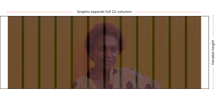
Graphic layout guide
The graphic extends to our 12-column grid. Heights are variable, which allows the flexibility to custom size your graphic to match your content. See image specs below in our Rules section.
PRO TIP: We recommend laying out your graphic maintaining a 8:3 aspect ratio. This helps reduce the overall height of the graphic.
Rules and recommendations

| Component element | Optional element | Rules | ||
|---|---|---|---|---|
| A: Background color options |
|
|||
| B: Headline & intro blurb |
|
|||
| C: Image |
|
|||
| D: Image source |
|
|||
| E: CTA |
|
|||
| *NOTE: Due to varying alphabets and character widths, please ensure your publisher tests this prior to release | ||||
Alternate variations
All of our components have the ability to stack vertically as many times as your needs require, and include different background appearances. To help you visualize possible layouts, we stacked a few Image components together to give you a more clear understanding of how this could look.
An honest look in the mirror
We see a company that’s not there yet with racial and gender equality. But we also see a company that wants to do better.
By 2024, our goal is to increase representation of black professionals by 30%. And grow our women senior leaders to 32.5% globally by 2024 from 30%.

Do nots
We do not recommend using static charts/graphs, or non-transparent graphics in this component. If you do need a chart/graph, please check our Data visualization components..

Don’t. Don’t upload small graph/chart, or photograph into the full-width appearance, or incorrectly sized/scaled/cropped assets, as it will stretch, distort, and be illegible to the audience. Design for the appropriate placement.

Don’t. Don’t use a close up crop of a person’s face. If the image does not work in the dimension/ratio then choose another image.
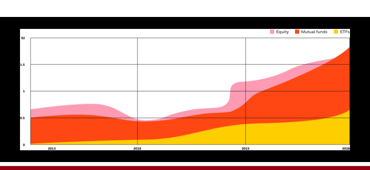
Don’t. If you do implement a static chart/graph, only use a transparent graphic. Design for the background you plan on using so our audience can see the data and legend information (black text on black bg = illegible).
Paragraph
The paragraph appearance allows for an image to align either right or left, options for 2 headline sizes, longer body copy limits than all of our other “image” / content components (i.e. CTA with image), along with an optional CTA. It has rich html functionality so you can hyperlink to related content for example. See below for our sizing recommendations.
Note: The main differences between this appearance and our CTA with image is this appearance has:
- Two headline size options
- Ability to turn off the top padding
- Top alignment of body copy and graphical image
- Larger flexible graphic dimensions for a more impactful image (height is not fixed)
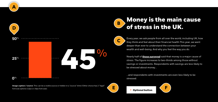
Money is the main cause of stress in the UK.

Image caption / source: This can be a visible source or hidden in a “source” blind. Either choice has 2 “legal” font size options (12px or 16px font size).
Every year, we ask people from all over the world, including UK, how they think and feel about their financial health.This year, we went deeper than ever to understand the connection between your wealth and well-being. And why you feel the way you do.
Nearly half of those surveyed said that money is a major cause of stress. The figure increases to two-thirds among those without savings or investments. Respondents with savings are less likely to be stressed about money...
…and respondents with investments are even less likely to be stressed.
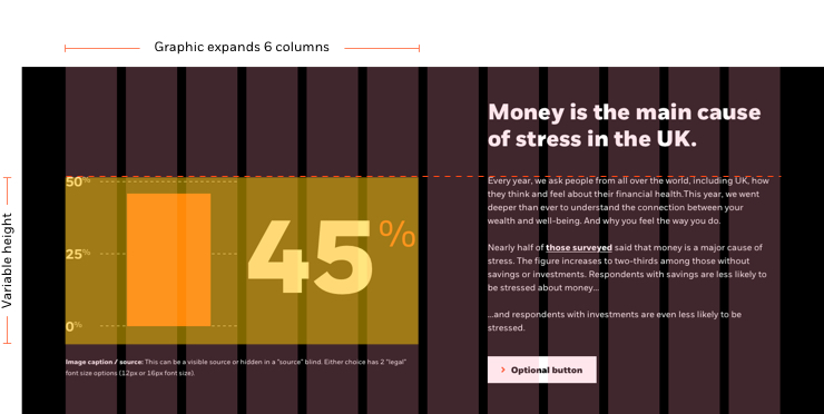
Graphic layout guide
The graphic is top-aligned to the body copy in this appearance. Heights are variable, which allows the flexibility to custom size your graphic to match your content. See image specs below in our Rules section.
PRO TIP: If your content isn’t using the maximum character counts, then you can reduce the height of your graphic to accommodate that need.
Rules and recommendations
| Component element | Optional element | Rules | ||
|---|---|---|---|---|
| A: Background color options |
|
|||
| B: Headline |
|
|||
| C: Body copy |
|
|||
| D: Image |
|
|||
| E: Image source |
|
|||
| F: CTA |
|
|||
| *NOTE: Due to varying alphabets and character widths, please ensure your publisher tests this prior to release | ||||
Alternate variations
All of our components have the ability to stack vertically as many times as your needs require, and are flexible enough to handle multiple content needs, as well as include different background appearances. Here is an alternate example to help you visualize possible content ideas.
Philipp Hildebrand, Vice Chairman of BlackRock

Philipp Hildebrand, Vice Chairman of BlackRock, is a member of the firm's Global Executive Committee. He also oversees the BlackRock Investment Institute (BII) and BlackRock Sustainable Investing (BSI).
Mr. Hildebrand joined BlackRock in 2012. Prior to that, he served as Chairman of the Governing Board of the Swiss National Bank (SNB). In that capacity, he was also a Director of the Bank for International Settlements (BIS), the Swiss Governor of the International Monetary Fund (IMF) and a member of the Financial Stability Board (FSB), of which the Leaders of the G20 appointed him Vice Chairman in 2011. He was also Chairman of the Administrative Committee of the Board of Directors of the BIS
Do nots
We do not recommend using static charts/graphs, or non-transparent graphics in this component. If you do need a chart/graph, please check our Data visualization components.
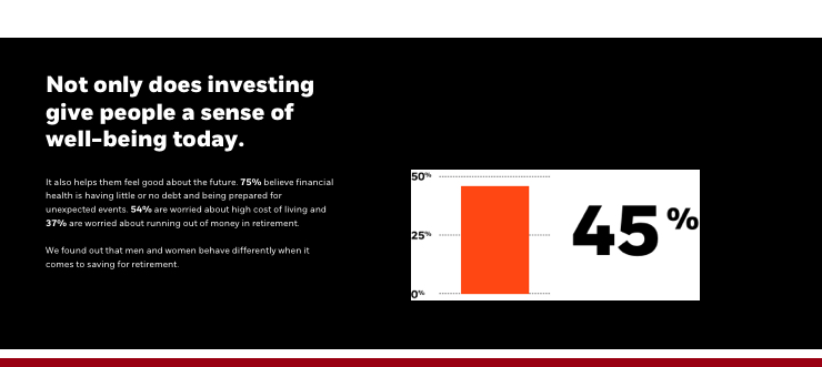
Don’t. If you do implement a static chart/graph, only use a transparent graphic. Design for the background you plan on using so our audience can see the data and legend information (black text on black bg = illegible).
Don’t. Don’t upload small graph/chart, or photograph into the full-width appearance, or incorrectly sized/scaled/cropped assets, as it will stretch, distort, and be illegible to the audience. Design for the appropriate placement.
Don’t. Don’t use pictograms. They were not designed for use at larger size.
Key points
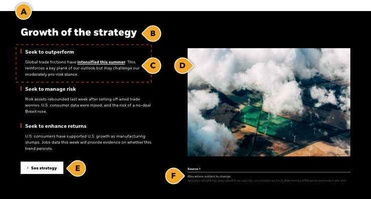
The key points are intended to summarize the image content into bite-size snippets of key information. There is a minimum of 2 bullets required for this appearance.
Note: The main differences between this appearance and our “Portrait with key points” is this appearance has:
- Two headline size options vs. 1 pre-set size
- No ability to have an introductory blurb above your key points
- This appearance has “bullet” tick marks
- Image aligns to the top of the bullets vs. top-aligning with the headline
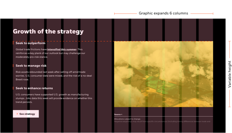
- Image takes up 6 columns (wider image) vs. 5 columns in the Portrait appearance
- See Graphic layout reference below
Growth of the strategy

Allocations subject to change.
Negative weightings may result from specific circumstances (including timing differences between trade and settle dates of securities purchased by the funds) and/or the use of certain financial instruments, including derivatives, which may be used to gain or reduce market exposure and/or risk management.
Global trade frictions intensified this summer. This reinforces a key plank of our outlook but may challenge our moderately pro-risk1 stance.
Risk assets rebounded last week after selling off amid trade worries. U.S. consumer data were mixed, and the risk of a no-deal Brexit rose.
U.S. consumers have supported U.S. growth as manufacturing slumps. Jobs data this week will provide evidence on whether this trend persists.
Graphic layout
The graphic is top-aligned to the bullet copy in this appearance. Heights are variable, which allows the flexibility to custom size your graphic to match your content. See image specs below in our Rules section.
PRO TIP: If your content isn’t using the maximum options (i.e. using only 3 bullets), then you can reduce the height of your graphic to accommodate that need.
Rules and recommendations
| Component element | Optional element | Rules | ||
|---|---|---|---|---|
| A: Background color options |
|
|||
| B: Headline |
|
|||
| C: Key point bullets |
|
|||
| D: Image |
|
|||
| E: CTA |
|
|||
| E: Image source | ||||
| *NOTE: Due to varying alphabets and character widths, please ensure your publisher tests this prior to release | ||||
Alternate variations
All of our components have the ability to stack vertically as many times as your needs require, and are flexible enough to handle multiple content needs, as well as include different background appearances. Here is an alternate example to help you visualize possible content ideas.
Considerations for retirement savings

Make sure you are aware of your plan’s rules regarding loans and hardship withdrawals. If they are permitted, consider the applicable terms such as maximum amounts, and repayment terms and timing.
Consider whether it would be less costly to take a personal or equity loan, or a loan from a family member, rather than draw on your retirement savings.
If you need help making a decision, you may want to consider speaking to a tax advisor, consulting with your plan sponsor or reviewing guidance from the Internal Revenue Service.
Do nots
We do not recommend using static charts/graphs, or non-transparent graphics in this component. If you do need a chart/graph, please check our Data visualization components.
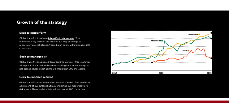
Don’t. If you do implement a static chart/graph, only use a transparent graphic. Design for the background you plan on using so our audience can see the data and legend information (black text on black bg = illegible).
Don’t. Don’t upload small graph/chart, or photograph into the full-width appearance, or incorrectly sized/scaled/cropped assets, as it will stretch, distort, and be illegible to the audience. Design for the appropriate placement.
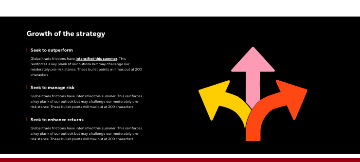
Don’t. Don’t use pictograms. They were not designed for use at larger size.
Portrait with key points
The portrait with key points are intended to summarize the image content into bite-size snippets of key information. There is a minimum of 2 bullets required for this appearance.
Note: The main differences between this appearance and our “Key points” is this appearance has:
- Only 1 pre-set headline size
- An introductory blurb above your key points
- This appearance does not have “bullet” tick marks
- Image top-aligns with the headline vs. aligning to the top of the bullets
- No option for image caption / source
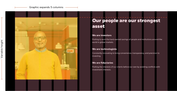
- Image takes up 5 columns (narrower image — i.e. portrait) vs. 6 columns in the Key points appearance
- See Graphic layout reference below

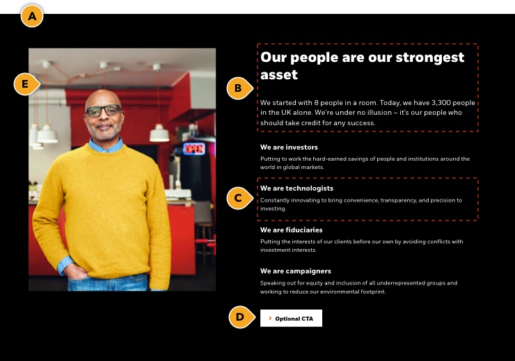
Our people are our strongest asset
We started with 8 people in a room. Today, we have 3,300 people in the UK alone. We’re under no illusion – it’s our people who should take credit for any success.
Graphic layout
The graphic is top-aligned to the headline in this appearance. Heights are variable, which allows the flexibility to custom size your graphic to match your content. See image specs below in our Rules section.
PRO TIP: If your content isn’t using the maximum options (i.e. using only 3 bullets), then you can reduce the height of your graphic to accommodate that need.
Rules and recommendations
| Component element | Optional element | Rules | ||
|---|---|---|---|---|
| A: Background color options |
|
|||
| B: Headline & intro blurb |
|
|||
| C: Key points |
|
|||
| D: CTA |
|
|||
| E: Image |
|
|||
| *NOTE: Due to varying alphabets and character widths, please ensure your publisher tests this prior to release | ||||
Alternate variations
All of our components have the ability to stack vertically as many times as your needs require, and are flexible enough to handle multiple content needs, as well as include different background appearances. Here is an alternate example to help you visualize possible content ideas.

Example: No intro copy and a smaller graphic
Do nots
We do not recommend using static charts/graphs, or non-transparent graphics in this component. If you do need a chart/graph, please check our Data visualization components.
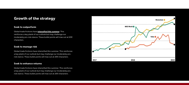
Don’t. If you do implement a static chart/graph, only use a transparent graphic. Design for the background you plan on using so our audience can see the data and legend information (black text on black bg = illegible).
Don’t. Don’t upload small graph/chart, or photograph into the full-width appearance, or incorrectly sized/scaled/cropped assets, as it will stretch, distort, and be illegible to the audience. Design for the appropriate placement.
Don’t. Don’t use pictograms. They were not designed for use at larger size.