Related content
The Related content component is used to highlight content that is related to the main page topic, and provide helpful page and resource links to the user. You can also highlight related content links that are complimentary to the main goal of your content page.
We’ve baked many features into this component, including the ability to:
- Add an optional XL, large (H2) or medium size (H3) headline with intro blurb
- Include hyperlinks in your optional intro paragraph
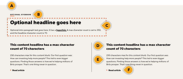
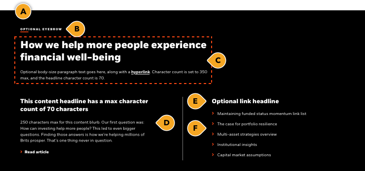
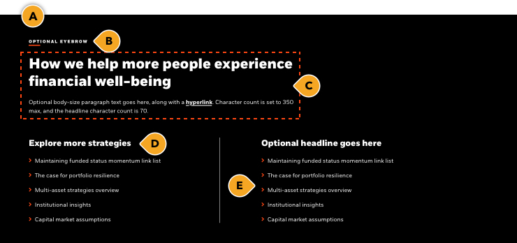
- Show 2 features, 1 feature and 1 link list (with up to 5 links), or 2 link lists
- All main appearances have the ability to remove component-level top padding on or off
- Note: Use this is to solve “double” padding issues when stacking similar colored components together which may cause large gaps to appear, and get pre-approval for guidance from the Design Platform team
PRO TIP: Use the large headline appearance if you are using this to introducing a new content section to your page; think of it as your H2. If this is used as support for an established section, use the “medium” size headline (H3).
Rules and recommendations

Rules and recommendations

| Component element | Optional element | Rules | ||
|---|---|---|---|---|
| A: Background color options | • BLK_Black • BLK_White • BLK_Neutral • BLK_Orange • BLK_Yellow • BLK_Pink |
|||
| B: Eyebrow | • Eyebrow character count: ~35* | |||
| C: Headline & intro blurb | • Headline character count: ~70* • XL (56px Extrabold), Large (40px Extrabold) = H2 — or — Medium (32px Bold) = H3 headline size option • Intro blurb character count: ~350* • Intro blurb can include hyperlink • Can have headline without the intro blurb |
|||
| D: Featured headline(s) | • See rules in the first tab -same rules apply | |||
| E: Link list headline | • Character counts: ~250* | |||
| F: Link list |
• 5 links max |
|||
| *NOTE: Due to varying alphabets and character widths, please ensure your publisher tests this prior to release | ||||
Rules and recommendations

| Component element | Optional element | Rules | ||
|---|---|---|---|---|
| A: Background color options | • BLK_Black • BLK_White • BLK_Neutral • BLK_Orange • BLK_Yellow • BLK_Pink |
|||
| B: Eyebrow | • Eyebrow character count: ~35* | |||
| C: Headline & intro blurb | • Headline character count: ~70* • XL (56px Extrabold), Large (40px Extrabold) = H2 — or — Medium (32px Bold) = H3 headline size option • Intro blurb character count: ~350* • Intro blurb can include hyperlink • Can have headline without the intro blurb |
|||
| D: Link list headlines | • Character counts: ~250* • Can turn left link list headline off if both columns are a continued list |
|||
| E: Link list |
• 5 links max |
|||
| *NOTE: Due to varying alphabets and character widths, please ensure your publisher tests this prior to release | ||||
• BLK_White
• BLK_Neutral
• BLK_Orange
• BLK_Yellow
• BLK_Pink
• XL (56px Extrabold), Large (40px Extrabold) = H2 — or — Medium (32px Bold) = H3 headline size option
• Intro blurb character count: ~350*
• Intro blurb can include hyperlink
• Can have headline without the intro blurb
• Keep these "digital" friendly; i.e. short descriptors