Super hero banner
The Super hero banner is our largest and most impactful banner. It should be used for specific high-traffic campaign landing pages, and should help set up diverse and related content for visitors to explore. We recommend using this banner sparingly and getting pre-approval from the design team prior to rolling your page out.
We’ve baked a few key features into this component, including the ability to:
- Have total control of how the image crops
- Full bleed background, offset image, or no image appearances
- Ability to turn component-level top padding on or off
- Note: Use this is to solve “double” padding issues when stacking similar colored components together which may cause large gaps to appear, and get pre-approval for guidance from the Design Platform team
Publishing? View the DCR guidebook for detailed instructions.
Full bleed image appearance
With our full-bleed background, the image sits within the color background, and has either a right or left-side image orientation.
For any of these layout options, you have the choice of where the image gets cropped from across different breakpoints; center, left or right side of the image container. This works for either right-side or left-side image orientation. See our “Image placement & cropping guide” for more details.
Full bleed image appearance
Intrinsicly morph technically sound paradigms with competitive systems. Assertively deliver competitive collaboration and idea-sharing before client-focused content.
Enthusiastically reintermediate maintainable processes rather than user friendly resources. Holisticly reinvent collaborative web services vis-a-vis progressive ideas.

Rules and recommendations
| Component element | Optional element | Rules | ||
|---|---|---|---|---|
| A: Background color options |
|
|||
| B: Eyebrow |
|
|||
| C: Headline |
|
|||
| D: Body copy |
|
|||
| E: Image |
|
|||
| F: Component CTA |
|
|||
| *NOTE: Due to varying alphabets and character widths, please ensure your publisher tests this prior to release | ||||
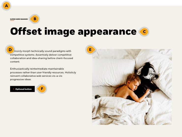
Offset image appearance
With our offset background, the image sits outside the color background, and has either a right or left-side image orientation. We have implemented a limited pre-selected “bottom border” color options to ensure a seamless stack of different colored components. See the bottom of the page for how this works.
Note: This must get pre-approval to ensure proper use.
For any of these layout options, you have the choice of where the image gets cropped from across different breakpoints; center, left or right side of the image container. This works for either right-side or left-side image orientation. See our “Image placement & cropping guide” for more details.
Offset image appearance
Intrinsicly morph technically sound paradigms with competitive systems. Assertively deliver competitive collaboration and idea-sharing before client-focused content.
Enthusiastically reintermediate maintainable processes rather than user friendly resources. Holisticly reinvent collaborative web services vis-a-vis progressive ideas.
Rules and recommendations
| Component element | Optional element | Rules | ||
|---|---|---|---|---|
| A: Background color options - Primary background |
|
|||
| a1: Offset bottom border - Secondary color options |
|
|||
| B: Eyebrow |
|
|||
| C: Headline |
|
|||
| D: Body copy |
|
|||
| E: Image |
|
|||
| E: Image |
|
|||
| *NOTE: Due to varying alphabets and character widths, please ensure your publisher tests this prior to release | ||||
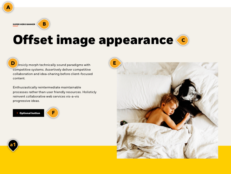
Example: Offset with bottom color
Intrinsicly morph technically sound paradigms with competitive systems. Assertively deliver competitive collaboration and idea-sharing before client-focused content.
Enthusiastically reintermediate maintainable processes rather than user friendly resources. Holisticly reinvent collaborative web services vis-a-vis progressive ideas.
Always use a matching bottom border
Or a hedge fund. Or an investment bank. What we are is a company that helps millions of people up and down the UK by investing their money for them. Money for their retirement. Money to buy a home. To pay for their children’s education. That’s been our purpose from day one, set by our founders who still work here tirelessly to achieve it. And you can take that to the bank.
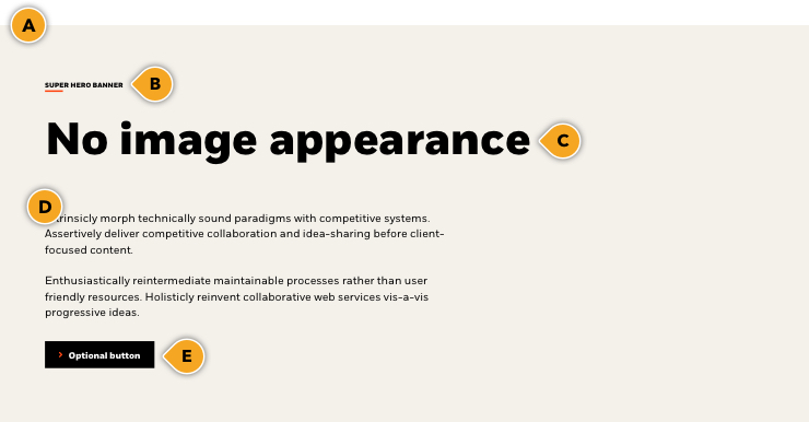
No image appearances
If your content requires an X-large headline but does not require an image, this is an option. It also allows for introductory copy and a CTA option. It has the same options as our “image” appearance, but without the image.
Note: This component has a lot of top/bottom padding baked in, so use this component sparingly, and it’s best to get design guidance prior to using it. It should only be used for specific, pre-approved pages.
Rules and recommendations
| Component element | Optional element | Rules | ||
|---|---|---|---|---|
| A: Background color options |
|
|||
| B: Eyebrow |
|
|||
| C: Headline |
|
|||
| D: Body copy |
|
|||
| E Component CTA |
|
|||
| *NOTE: Due to varying alphabets and character widths, please ensure your publisher tests this prior to release | ||||
Alternate variations
To help you visualize different possible layouts and background colors, we stacked a few components together to give you a more clear understanding of how this could look.