Paragraph
Use our Paragraph component to compose structured pages, and highlight information like data points (i.e. charts/graphs/images). It’s quite a complex component, containing various elements — from headlines, intro blurbs and body copy, to quotes, tables, images and more.
Publishing? View the DCR guidebook for detailed instructions.
The BlackRock typographic scale provides a range of font sizes, weights and styles to create hierarchical structured content. We aim to keep these styles to the minimum that work across our ecosystem. These follow our typographic brand guidelines.
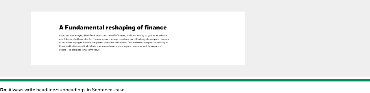
01. Headline & subheadings
Our main headline & subheading options have baked-in h2/h3 classes. Always begin your main section/page with the H2 headline, and for any related sub-sections use the H3 subheadings along with Subheading support if needed (i.e. tertiary sections).
This is our main h2 section heading
Use this for top-level main content sections on the page.
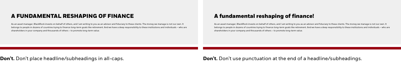
• This is our largest headline font size available: 40px extrabold
• Always written in Sentence-case
This is our h3/h4 subheading
Use this for sub-sections related to the main section of content.
• Both h-classes are the same font size & weight: 32px bold
• Always written in Sentence-case
02. Subheading support
To accompany subheadings and to add more context to your section headings, we provide a range of smaller sizes. These should always be used as support to the main subhead, i.e. a new sub-section related to the subheading or chart/graph headings.
Medium-text (Subheading support 1)
Use this as your tertiary headings/subheadings. It should always relate back to the main topic it is associated to.
• Font size: 24px extrabold
• Always written in Sentence-case
Small-text (Subheading support 2)
Use this for image/graph/chart headlines.
• Font size: 20px extrabold
• Always written in Sentence-case
03. Basic body text
Basic paragraph body text is defaulted to BODY-M (16px font size) across our entire .com ecosystem.
For any legal/source text, we use our BODY-S (12px font size), with the exception of localized needs (i.e. EMEA regions), always use BODY-M for regulatory purposes.
Default long-form body text
Legal & source text
Introductory blurb
This is an example of an introductory blurb. It should be a short, succinct piece of copy that helps the user understand at a high-level what you are trying to market or educate them on and what they can expect from the article/page. It comes with the option to include a bottom divider line to help visually separate the intro to the main content.
Rules for Introductory blurb:
• Optional bottom border - use it to help separate out your content block
• Remember, short and understandable is key here
• No character limit set
Bulleted / numbered lists
Whenever you need to list out your content, always use the paragraph component, as it is set to automatically align your bullet / numbered text.
Ordered and unordered lists:
- March brought more volatility, but coupon income drove a positive monthly return.
- Tax reform disruptions at year end drove a negative first-quarter return.
- Subdued primary issuance and strong retail demand continue to support the market.
Follow these steps:
- March brought more volatility, but coupon income drove a positive monthly return.
- Tax reform disruptions at year end drove a negative first-quarter return.
- Subdued primary issuance and strong retail demand continue to support the market.
CTAs (buttons & links)
You have the ability to add either a single Primary button (in two colors), or our Tertiary link style to your paragraph content.
We’ve baked many features into this component, including the ability to:
- Ability to turn top or bottom padding options on or off
- See example here
- Note: Use this is to solve “double” padding issues when stacking multiple paragraphs together which may cause large gaps to appear
- Get guidance from the Design Platform team
- Choose from a limited set of functional icons pre-baked in to all of our button appearances. You can see the list in the “Button iconography” section here
- Read more about best practices on our Buttons page
“Button primary core” example
“Button primary Pop” example
“CTA style” example
CTA padding guidance
By default, our paragraph buttons have a top padding of 30px, and a bottom padding of 40px. If, for example, the button is the last element before another stacked component (i.e. Messaging cross link), you may want to turn off the bottom padding to tighten up the space between CTA and the top of the following component. Keep in mind, it’s best practice to allow breathing room between elements.
Writing for buttons:
The purpose of buttons are to encourage the user to take action or continue through a journey. Writing copy is crucial to aiding them along this journey, so you should always be concise to what is to be expected when they click or tap, and avoid generic and non-specific language like “Learn more”.
As a rule of thumb, describe what action is about to happen, like “Download the PDF”, or “View sustainable strategies”. This copy is concise, and also accessibility compliant. Try not to write a full sentence.
Capitalization:
Buttons should always be written in Sentence case to maintain brand compatibility, and never all caps or initial caps.
Character counts:
We recommend keeping CTA copy under 20 characters, but there is no hard-coded limit.
Divider lines
We offer a set of 3 divider lines to help visually separate sections, content, and information. These centered within our paragraph body.
Small rule
Medium rule
Large rule
Images + footnotes
For basic image elements (photography/chart/graph/etc.) that align to our “paragraph” container widths, use this option. It tucks nicely within your editorials and marketing layouts, and is fully responsive across our grid breakpoints.
PRO TIP: For more complex data layouts that would be best suited for “full-width”, large formats, check out our Image component.
Here's an example graph headline (Small-text)
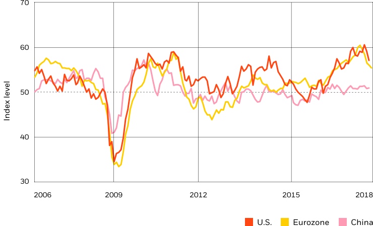
Source: Thomson Reuters Datastream, ISM and IHS Markit, chart by BlackRock Investment Institute. May 31, 2018.
Notes: PMI stands for Purchasing Managers’ Indexes. PMI is an economic indicator that is derived from monthly surveys of private sector companies. An index level above 50 indicates an improvement in manufacturing activity, while an index level below 50 indicates a decline.
Here's an example image headline (Small-text)

Rules for Images:
Images:
• Images align to our paragraph max width - 740px width with flexible height following a 16:9 ratio
• When using imagery, follow our Photography guidelines.
• Asset type: JPG/PNG/SVG
• All image assets must be optimized for the web: <300kb
Footnotes:
• If footnotes are needed, they are placed below the image in a smaller “legal” text size, which can be formated to include a link or stylized text.
Tool tips
Our tool tip classes are used to provide users additional, short explanations, when they aren’t described directly in the user interface. On-hover of the icon, a popover is introduced that allows for more context. Use these sparingly, as it can overwhelm a page quickly.
Growth of Hypothetical $10,000
Rules for Tool tips:
• A tool tip should be clear and concise messaging — we do not restrict the copy length, but keep in mind the length of copy you place in this container; it should help the user, not overwhelm them
• Do not overload a page with tool tips. Use your best content and UX judgement in balancing the ratio of tool tips
• Publishers can introduce a tool tip to any paragraph directly from tinyMCE. To edit or delete the tooltip Publishers must go into the source view to modify
Tables
Our tables are very basic, they allow for a small amount of static data to be presented to our users, and aligns to our “paragraph” container widths. It tucks nicely within your editorials and marketing layouts, and is fully responsive across our grid breakpoints.
| Equities | Week | YTD | 12 Months | Div. Yield |
|---|---|---|---|---|
| U.S. Large Caps | 0.1% | 6.9% | 4.7% | 2.1% |
| U.S. Small Caps | -0.1% | 9.3% | 3.3% | 1.4% |
| Non-U.S. World | 2.8% | 6.1% | -1.2% | 3.1% |
| Non-U.S. Developed | 2.8% | 1.9% | -4.4% | 3.4% |
Rules for Tables:
• Recommended no more than 5-7 columns, depending on the data or content you are presenting to the user
• Filter capability is not available
• Table scales in responsive views – please test your content to ensure legibility across devices