Featured article (vi16 )

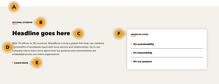
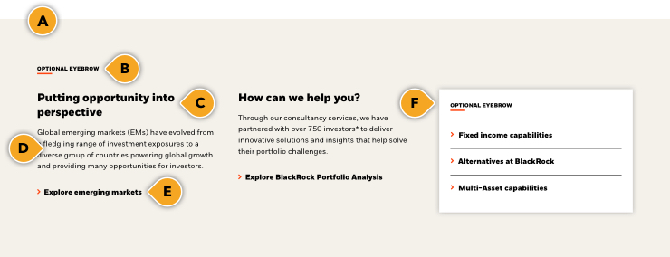
Our Featured article component has two main appearance options depending on your page / content needs:

  1. A “default” appearance that is best suited to highlight an important, timely article or insight from our strategists and portfolio managers. It comes with a built-in “marketing / ad” tile that should be used to drive the user to the latest podcast, announcement, or related topic.
  2. Our new “brand” appearance that is best suited to help continue to drive your users along a specific related journey, and should sit at the bottom of your marketing pages. Think of it as “what’s next” content, along with helpful links to engage the user to additional useful, relevant content.


Publishing? View the DCR guidebook for detailed instructions.


Paragraph-2,Featured Article-1,Paragraph-3,Advance Static Table-1,Paragraph-4,Featured Article-2,Dynamic Article List-1
Paragraph-5,Featured Article-3,Paragraph-6,Advance Static Table-2,Paragraph-7,Featured Article-4,Featured Article-5
Paragraph-8,Featured Article-6,Paragraph-9,Advance Static Table-3,Paragraph-10,Featured Article-7,Featured Article-8

Featured article (default )

The “default” appearance is best suited to highlight an important, timely article or insight from our strategists and portfolio managers. It comes with a built-in “marketing / ad” tile that should be used to drive the user to the latest podcast, announcement, or related topic.

Keep in mind that this component is a manually updated component, so you should always maintain up-to-date content, and refreshed regularly with the latest thought-pieces.

We recommend using this primarily on insight hub pages, and should always be paired with our Dynamic article component.

  • Both the “featured” article and the “marketing” tile are one component. You can not remove the tile, or alter its color
  • All main appearances have the ability to remove component-level top padding on or off
    • See example here
    • Note: Use this is to solve “double” padding issues when stacking similar colored components together which may cause large gaps to appear, and get pre-approval for guidance from the Design Platform team

podcast

Listen to The Bid – BlackRock’s investment podcast

Rules and recommendations

featured article rules image
Component elementOptional elementRules
Component elementA: Background color options Optional element Rules
  • BLK_White with black marketing tile only
Component elementB: Eyebrow Optional element  Rules
  •  Eyebrow character count: ~35*
Component elementC: Headline Optional element Rules
  • Headline character count: ~70* (recommended)
  • No hard coded limit, but please keep these short and consice (or replicate the article title you are driving to)
Component elementD: Date / Author Optional element Rules
  • Manaul input - please provide publication date and author
Component elementE: Body copy Optional element Rules
  • Body copy character count: ~140* then truncates
Component elementF: CTA Optional element Rules
  • CTA should be tertiary link
  • Keep these "digital" friendly; i.e. short descriptors
Component elementG: Marketing tile Eyebrow Optional element  Rules
  • Eyebrow character count: ~35*
Component elementH: Marketing tile headline Optional element Rules
  • Headline character count: ~70* (recommended)
  • No hard coded limit, but please keep these short and consice
Component elementI: CTA Optional element Rules
  • CTA should be tertiary link
  • Keep these "digital" friendly; i.e. short descriptors
Component element*NOTE: Due to varying alphabets and character widths, please ensure your publisher tests this prior to release Optional element Rules
Showing 1 to 10 of 10 entries

Recommended usage

As mentioned above, we recommend using this primarily on insight hub pages, and should always be paired with our Dynamic article component. Below is an example of what this would look like on your marketing pages.

podcast

Listen to The Bid – BlackRock’s investment podcast