Line graphs
Line graphs express change over short - and long time periods, such as stock price performance.
Where small changes exist in a dataset, line graphs emphasize exact values, so are better to use than bar charts.
Line graphs can also be used to compare change over time for more than one group, giving you multiple lines on one graph. Remember, all lines should express a response to the same question.
Publishing? View the DCR guidebook for detailed instructions.
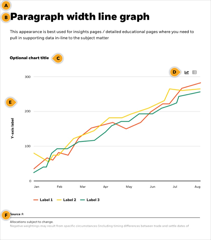
Paragraph width line graph
This appearance is best used for insights pages / detailed educational pages where you need to pull in supporting data in-line to the subject matter.
Allocations subject to change.
Negative weightings may result from specific circumstances (including timing differences between trade and settle dates of securities purchased by the funds) and/or the use of certain financial instruments, including derivatives, which may be used to gain or reduce market exposure and/or risk management.
Test
Testing this example
Full width line graph
This appearance is best used for insights pages / detailed educational pages where you need to pull in supporting data in-line to the subject matter.
Rules and recommendations

| Component element | Optional element | Rules | ||
|---|---|---|---|---|
| A: Background |
|
|||
| B: Main headline/Intro |
|
|||
| C: Chart title |
|
|||
| D: Toggle View |
|
|||
| E: Chart |
|
|||
| F: Source/Caption |
|
|||
| *NOTE: Due to varying alphabets and character widths, please ensure your publisher tests this prior to release | ||||
Alternate variations
All of our components have the ability to stack vertically as many times as your needs require, and include different background appearances. To help you visualize possible layouts, we stacked a few Image components together to give you a more clear understanding of how this could look.
Resilient assets in an environment of uncertainty max out at seventy
The coronavirus outbreak is set to deliver a sharp and deep economic shock. Market moves are reminiscent of the 2008 crisis, but we don’t think this is a repeat. String some containment and social distancing policies will bring economic activity to a near standstill, but provided aggressive fiscal and monetary policy actions are taken for business.
Allocations subject to change.
Negative weightings may result from specific circumstances (including timing differences between trade and settle dates of securities purchased by the funds) and/or the use of certain financial instruments, including derivatives, which may be used to gain or reduce market exposure and/or risk management.
Key points
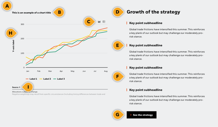
Use this option to highlight a few key points next to a chart or datapoint. This option works well if there are points or implications that might not be obvious from the chart itself and need to be called out. You can also use this area to cite related data from other sources.
Allocations subject to change.
Negative weightings may result from specific circumstances (including timing differences between trade and settle dates of securities purchased by the funds) and/or the use of certain financial instruments, including derivatives, which may be used to gain or reduce market exposure and/or risk management.
Growth of the strategy
Global trade frictions have intensified this summer. This reinforces a key plank of our outlook but may challenge our moderately pro-risk stance.
Global trade frictions have intensified this summer. This reinforces a key plank of our outlook but may challenge our moderately pro-risk stance.
Global trade frictions have intensified this summer. This reinforces a key plank of our outlook but may challenge our moderately pro-risk stance. Text Style
Global trade frictions have intensified this summer. This reinforces a key plank of our outlook but may challenge our moderately pro-risk stance.
Rules and recommendations

| Component element | Optional element | Rules | ||
|---|---|---|---|---|
| A: Background |
|
|||
| B: Chart title |
|
|||
| C: Toggle View |
|
|||
| D: Main headline/Intro |
|
|||
| E: Key points subheadline |
|
|||
| F: Key points description |
|
|||
| G: CTA |
|
|||
| H: Chart |
|
|||
| I: Source / Caption |
|
|||
| *NOTE: Due to varying alphabets and character widths, please ensure your publisher tests this prior to release | ||||
Alternate variations
All of our components have the ability to stack vertically as many times as your needs require, and include different background appearances. To help you visualize possible layouts, we stacked a few Image components together to give you a more clear understanding of how this could look.
Allocations subject to change.
Negative weightings may result from specific circumstances (including timing differences between trade and settle dates of securities purchased by the funds) and/or the use of certain financial instruments, including derivatives, which may be used to gain or reduce market exposure and/or risk management.
Growth of the strategy
Global trade frictions have intensified this summer. This reinforces a key plank of our outlook but may challenge our moderately pro-risk stance.
Global trade frictions have intensified this summer. This reinforces a key plank of our outlook but may challenge our moderately pro-risk stance.
Global trade frictions have intensified this summer. This reinforces a key plank of our outlook but may challenge our moderately pro-risk stance.
Global trade frictions have intensified this summer. This reinforces a key plank of our outlook but may challenge our moderately pro-risk stance.
Description
Use this option when you’d like to provide additional information about the data displayed. You can use the text next to it to provide context to the data, highlight additional points, or link out to additional content.
Allocations subject to change.
Negative weightings may result from specific circumstances (including timing differences between trade and settle dates of securities purchased by the funds) and/or the use of certain financial instruments, including derivatives, which may be used to gain or reduce market exposure and/or risk management.
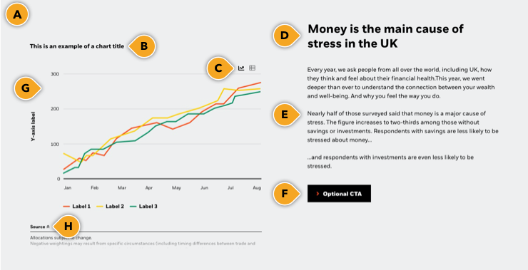
Money is the main cause of stress in the UK
Every year, we ask people from all over the world, including UK, how they think and feel about their financial health. This year, we went deeper than ever to understand the connection between your wealth and well-being. And why you feel the way you do.
Nearly half of those surveyed said that money is a major cause of stress. The figure increases to two-thirds among those without savings or investments. Respondents with savings are less likely to be stressed about money...
…and respondents with investments are even less likely to be stressed.
Rules and recommendations

| Component element | Optional element | Rules | ||
|---|---|---|---|---|
| A: Background |
|
|||
| B: Chart title |
|
|||
| C: Toggle View |
|
|||
| D: Main headline/Intro |
|
|||
| E: Blurb description |
|
|||
| F: CTA |
|
|||
| G: Chart |
|
|||
| H: Source / Caption |
|
|||
| *NOTE: Due to varying alphabets and character widths, please ensure your publisher tests this prior to release | ||||
Alternate variations
All of our components have the ability to stack vertically as many times as your needs require, and include different background appearances. To help you visualize possible layouts, we stacked a few Image components together to give you a more clear understanding of how this could look.
Allocations subject to change.
Negative weightings may result from specific circumstances (including timing differences between trade and settle dates of securities purchased by the funds) and/or the use of certain financial instruments, including derivatives, which may be used to gain or reduce market exposure and/or risk management.
Money is the main cause of stress in the UK
Every year, we ask people from all over the world, including UK, how they think and feel about their financial health. This year, we went deeper than ever to understand the connection between your wealth and well-being. And why you feel the way you do.
Nearly half of those surveyed said that money is a major cause of stress. The figure increases to two-thirds among those without savings or investments. Respondents with savings are less likely to be stressed about money...
…and respondents with investments are even less likely to be stressed.