Content block
The Content block component was created to offer an alternative 2-column layout option to our standard 1-column paragraph appearances. This allows the headline and introduction to the page content to stand out more, with the content indented down the page.
We’ve baked many features into this component, including the ability to:
- Have a larger main section headline
- Include a introductory paragraph (slightly larger text size than our default standard text size)
- CTA and hyperlink capabilities
- Add multiple H3 sub-sections with standard paragraph text size
- Add image(s) and CTA options to the sub-section
- Ability to turn component-level top padding on or off
- Note: Use this is to solve “double” padding issues when stacking similar colored components together which may cause large gaps to appear, and get pre-approval for guidance from the Design Platform team
Publishing? View the DCR guidebook for detailed instructions.
Main headline with introductory text
We’re making sustainability the new standard for investing. It’s our strong conviction that integrating sustainability can help investors build more resilient portfolios and achieve better long-term outcomes.
Throughout our entire history, we’ve continued to seek new ways of contributing to a more equitable, resilient future for all of our stakeholders as well as the people in the communities where we live and work.
Rules and recommendations

| Component element | Optional element | Rules | ||
|---|---|---|---|---|
| A: Background color options |
|
|||
| B: Headline |
|
|||
| C: Intro text |
|
|||
| D: CTA |
|
|||
| *NOTE: Due to varying alphabets and character widths, please ensure your publisher tests this prior to release | ||||
Alternate variations
To help you visualize alternate background colors, we placed another component below to give you a more clear understanding of how this could look. You can also view this component on our UK site.
Main headline with introductory text
We’re making sustainability the new standard for investing. It’s our strong conviction that integrating sustainability can help investors build more resilient portfolios and achieve better long-term outcomes. Throughout our entire history, we’ve continued to seek new ways of contributing to a more equitable, resilient future for all of our stakeholders as well as the people in the communities where we live and work.
Example with optional sub-section content
We’re making sustainability the new standard for investing. It’s our strong conviction that integrating sustainability can help investors build more resilient portfolios and achieve better long-term outcomes.
Throughout our entire history, we’ve continued to seek new ways of contributing to a more equitable, resilient future for all of our stakeholders as well as the people in the communities where we live and work.

Sustainable investing is about investing in progress, and recognising that companies solving the world’s biggest challenges can be best positioned to grow. It is about pioneering better ways of doing business, and creating the momentum to encourage more and more people to opt in to the future we’re working to create.
Through the combination of traditional investment approaches with environmental, social and governance (ESG) insights, investors ranging from global institutions to individuals are taking a sustainable approach to pursuing their investment goals.
Rules and recommendations
| Component element | Optional element | Rules | ||
|---|---|---|---|---|
| A: Background color options |
|
|||
| B: Headline |
|
|||
| C: Intro text |
|
|||
| D: Intro CTA |
|
|||
| E: Sub-section: Subheadline |
|
|||
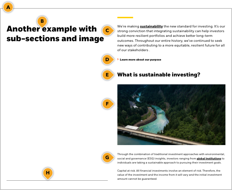
| F: Sub-section: Image |
|
|||
| G: Sub-section: Paragraph body copy |
|
|||
| H: Sub-section: Bottom border |
|
|||
| *NOTE: Due to varying alphabets and character widths, please ensure your publisher tests this prior to release | ||||