Tables
The Table component is a very versatile component that should be used to organize data and information that is too detailed or complicated to be described adequately in the text, allowing the reader to quickly see the results. They can be used to highlight trends or patterns in the data and to make a webpage more readable by removing numeric data from the text.
There are 4 table styles currently available. Each has been designed to accommodate for varying use cases and content display. Please familiarize yourself with the different table options to ensure that you utilize the one that is most appropriate for your needs.
Each table is available in Paragraph width or Full width. All options are the same for both appearances.
We’ve baked many features into this component, including the ability to:
• Add either a large (H2) or medium size (H3) headline with intro blurb
• Use select Font Awesome icons
• Alternate row striping for easier legibility of large tables
• Hide lengthy sources in a blind
• Include an optional CTA
If you're a publisher, you can also refer to our technical documentation for more details on creating the table component in Teamsite (internal access only).
PRO TIP: Use the large headline appearance if you are using this to introducing a new content section to your page; think of it as your H2. If this is used as support for an established section, use the “medium” size headline (H3).
Publishing? View the DCR guidebook for detailed instructions.
Simple table
The Simple table is the most versatile of the group. It allows for text and numerical data. Imagery, iconography or pictograms are not supported.
The Paragraph width appearance should be used for data that requires 5 columns or less.
The Full width appearance should be used for data that requires 6 columns or more.
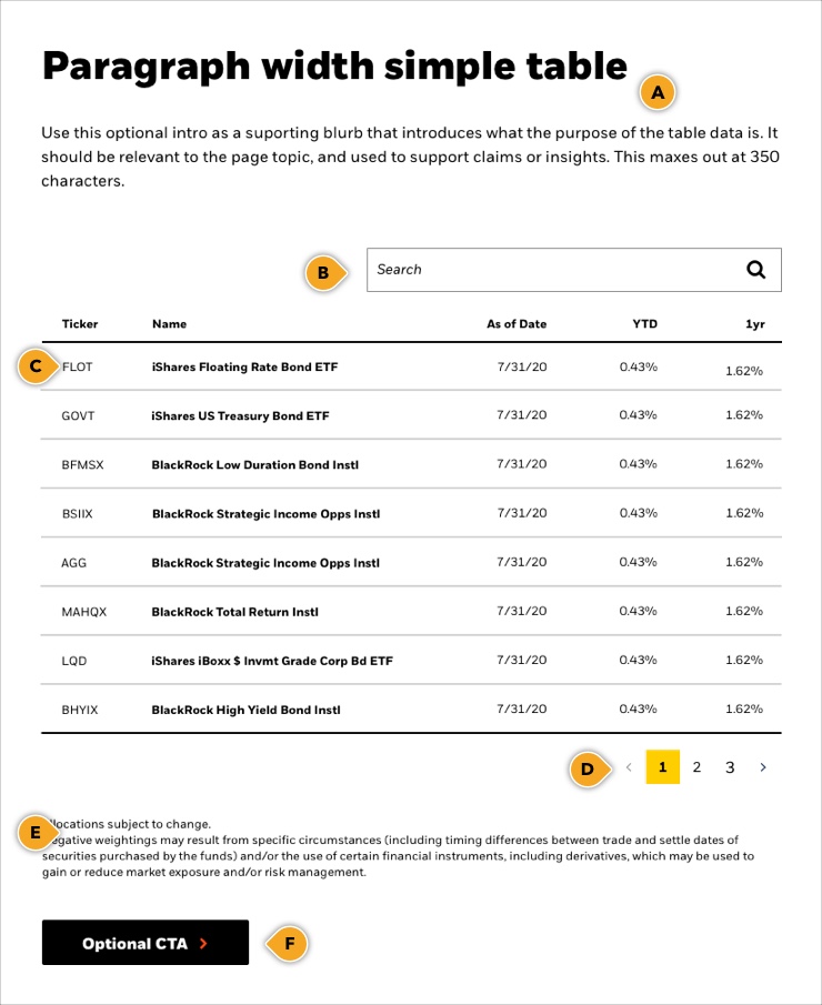
Paragraph width simple table
Use this optional intro as a supporting blurb that introduces what the purpose of the table data is. It should be relevant to the page topic, and used to support claims or insights. This maxes out at 350 characters.
| Ticker | Name | As of Date | YTD | 1yr |
|---|---|---|---|---|
| FLOT | iShares Floating Rate Bond ETF | 7/31/20 | 0.43% | 1.62% |
| GOVT | iShares US Treasury Bond ETF | 7/31/20 | 0.43% | 1.62% |
| BFMSX | BlackRock Low Duration Bond Instl | 7/31/20 | 0.43% | 1.62% |
| BSIIX | BlackRock Strategic Income Opps Instl | 7/31/20 | 0.43% | 1.62% |
| AGG | BlackRock Strategic Income Opps Instl | 7/31/20 | 0.43% | 1.62% |
| MAHQX | BlackRock Total Return Instl | 7/31/20 | 0.43% | 1.62% |
| LQD | iShares iBoxx $ Invmt Grade Corp Bd ETF | 7/31/20 | 0.43% | 1.62% |
| BHYIX | BlackRock High Yield Bond Instl | 7/31/20 | 0.43% | 1.62% |
Allocations subject to change.
Negative weightings may result from specific circumstances (including timing differences between trade and settle dates of securities purchased by the funds) and/or the use of certain financial instruments, including derivatives, which may be used to gain or reduce market exposure and/or risk management.
Full width simple table
Central banks, such as the Federal Reserve System banks in the United States and Bank of England in the United Kingdom, are strong players in public finance, acting as lenders of last resort as well as strong influences on monetary and credit conditions in the economy.
| Ticker | Name | As of Date | YTD | 1yr | 5yr | 10yr | Since Inception* | Inception Date |
|---|---|---|---|---|---|---|---|---|
| FLOT | iShares Floating Rate Bond ETF | 7/31/20 | 0.43% | 1.62% | 1.80% | - | 1.39% | 6/14/11 |
| GOVT | iShares US Treasury Bond ETF | 7/31/20 | 0.43% | 1.62% | 1.80% | - | 1.39% | 6/14/11 |
| BFMSX | BlackRock Low Duration Bond Instl | 7/31/20 | 0.43% | 1.62% | 1.80% | 2.42% | 1.39% | 6/14/11 |
| BSIIX | BlackRock Strategic Income Opps Instl | 7/31/20 | 0.43% | 1.62% | 1.80% | 3.68% | 1.39% | 6/14/11 |
| AGG | BlackRock Strategic Income Opps Instl | 7/31/20 | 0.43% | 1.62% | 1.80% | 3.77% | 1.39% | 6/14/11 |
| MAHQX | BlackRock Total Return Instl | 7/31/20 | 0.43% | 1.62% | 1.80% | 4.75% | 1.39% | 6/14/11 |
| LQD | iShares iBoxx $ Invmt Grade Corp Bd ETF | 7/31/20 | 0.43% | 1.62% | 1.80% | 6.12% | 1.39% | 6/14/11 |
| BHYIX | BlackRock High Yield Bond Instl | 7/31/20 | 0.43% | 1.62% | 1.80% | 6.84% | 1.39% | 6/14/11 |
Allocations subject to change.
Negative weightings may result from specific circumstances (including timing differences between trade and settle dates of securities purchased by the funds) and/or the use of certain financial instruments, including derivatives, which may be used to gain or reduce market exposure and/or risk management.
Rules and recommendations

Usage
- The Paragraph width appearance should be used for tables with 5 columns or less.
• NOTE: This recommendation is based on the assumption of tables consisting of primarily numerical data. If your table is very text-heavy and the content looks too cramped in the space, please use the Full width appearance to maintain legibility of your information. - The Full width appearance should be used for tables with 6 columns or more.
| Component element | Optional element | Rules | ||
|---|---|---|---|---|
| A: Main headline + intro |
|
|||
| B: Search |
|
|||
| C: Table |
|
|||
| D: Pagination |
|
|||
| E: Source/Caption |
|
|||
| F: CTA |
|
|||
| *NOTE: Due to varying alphabets and character widths, please ensure your publisher tests this prior to release | ||||
The Commentary was designed to accomodate more text-heavy content such as market analysis insights and portfolio / asset manager perspectives such as the example below illustrates. The table supports select Font Awesome icons.
Due to the nature of the content displayed in the commentary table it is only available to to use in the Full width appearance to maintain easy readability.
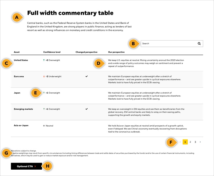
Full width commentary table
Central banks, such as the Federal Reserve System banks in the United States and Bank of England in the United Kingdom, are strong players in public finance, acting as lenders of last resort as well as strong influences on monetary and credit conditions in the economy.
| Assets | Confidence level | Changed perspective | Our perspective |
|---|---|---|---|
| United States | +2 Overweight | We keep U.S. equities at neutral. Rising uncertainty aronud the 2020 election and a wide range of policy outcomes may weigh on sentiment and prevent a repeat of outperformance. | |
| Euro area | -2 Overweight | We maintain European equities at underweight after a stretch of outperformance – and see greater upside in cyclical exposures elsewhere. Markets look to have fully priced in the ECB’s easing. | |
| Japan | +1 Overweight | We maintain European equities at underweight after a stretch of outperformance – and see greater upside in cyclical exposures elsewhere. Markets look to have fully priced in the ECB’s easing. | |
| Emerging markets | +1 Overweight | We keep an overwieght in EM equities and see them as beneficiaries from the global recovery. EM central banks are likely to stay on their easing paths, supporting the growth and equity markets. | |
| Asia ex-Japan | Neutral | We hold Asia ex-Japan equities at neutral amid prospects of a growth uptick, even if delayed. We see China’s economy eventually recovering from disruptions tied to the coronavirus outbreak. |
Allocations subject to change.
Negative weightings may result from specific circumstances (including timing differences between trade and settle dates of securities purchased by the funds) and/or the use of certain financial instruments, including derivatives, which may be used to gain or reduce market exposure and/or risk management.
Rules and recommendations

Usage:
As the content of a commentary table tends to be very text-heavy, it is only available to use in the Full width appearance to maintain easy readability.
| Component element | Optional element | Rules | ||
|---|---|---|---|---|
| A: Main headline + intro |
|
|||
| B: Search |
|
|||
| C: Table |
|
|||
| D: Commentary |
|
|||
| E: Available FontAwesome icons |
|
|||
| F: Pagination |
|
|||
| G: Source/Caption |
|
|||
| H: CTA |
|
|||
| *NOTE: Due to varying alphabets and character widths, please ensure your publisher tests this prior to release | ||||
The Category table was designed for displaying comparative data across different data groupings such as asset classes as the example below illustrates.
The Paragraph width appearance should be used for data that requires 5 columns or less.
The Full width appearance should be used for data that requires 6 columns or more.
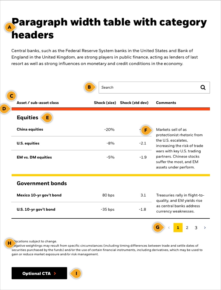
Paragraph width table with category headers
Central banks, such as the Federal Reserve System banks in the United States and Bank of England in the United Kingdom, are strong players in public finance, acting as lenders of last resort as well as strong influences on monetary and credit conditions in the economy.
| Asset / sub-asset class | Shock (size) | Shock (std dev) | Comments | |||
|---|---|---|---|---|---|---|
| Equities | ||||||
| China equities | -20% | -3.3 | Markets sell of as protectionist rhetoric from the U.S. escalates, increasing the risk of trade wars with key U.S. trading partners. Chinese stocks suffer the most, and EM assets under perform. | |||
| U.S. equities | -5% | -2.1 | ||||
| EM vs. DM equities | -5% | -1.9 | ||||
| Government bonds | ||||||
| Mexico 10-yr gov’t bond | 80 bps | 3.1 | Treasuries rally in flight-to-quality, and EM yields rise as central banks address currency weaknesses. | |||
| U.S. 10-yr gov’t bond | -35 bps | -1.8 | ||||
Allocations subject to change.
Negative weightings may result from specific circumstances (including timing differences between trade and settle dates of securities purchased by the funds) and/or the use of certain financial instruments, including derivatives, which may be used to gain or reduce market exposure and/or risk management.
Rules and recommendations

Usage:
- The Paragraph width appearance should be used for tables with 5 columns or less.
- The Full width appearance should be used for tables with 6 columns or more.
| Component element | Optional element | Rules | ||
|---|---|---|---|---|
| A: Main headline + intro |
|
|||
| B: Search |
|
|||
| C: Table |
|
|||
| D: Category divider bars |
|
|||
| E: Category header |
|
|||
| F: Comments (optional) |
|
|||
| G: Pagination |
|
|||
| H: Source/Caption |
|
|||
| I: CTA |
|
|||
| *NOTE: Due to varying alphabets and character widths, please ensure your publisher tests this prior to release | ||||
Alternate variation - Full-width table with category headers
Central banks, such as the Federal Reserve System banks in the United States and Bank of England in the United Kingdom, are strong players in public finance, acting as lenders of last resort as well as strong influences on monetary and credit conditions in the economy.
| Asset / sub-asset class | Shock (size) | Shock (std dev) | Capital loss/gain | Return (%) | Value | |||||||
|---|---|---|---|---|---|---|---|---|---|---|---|---|
| Equities | ||||||||||||
| China equities | -20% | -3.3 | -$1.45M | -3.3 | ||||||||
| U.S. equities | -5% | -2.1 | -$458,091 | -2.1 | -2.1 | |||||||
| EM vs. DM equities | -5% | -1.9 | ||||||||||
| Government bonds | ||||||||||||
| Mexico 10-yr gov’t bond | 80 bps | 3.1 | $750,000 | 3.1 | ||||||||
| U.S. 10-yr gov’t bond | -35 bps | -1.8 | -$560,000 | -1.8 | ||||||||
Allocations subject to change.
Negative weightings may result from specific circumstances (including timing differences between trade and settle dates of securities purchased by the funds) and/or the use of certain financial instruments, including derivatives, which may be used to gain or reduce market exposure and/or risk management.
The comparison table, as its name implies, was designed to compare features across products.
The Paragraph width appearance should be used for data that requires 5 columns or less.
The Full width appearance should be used for data that requires 6 columns or more.
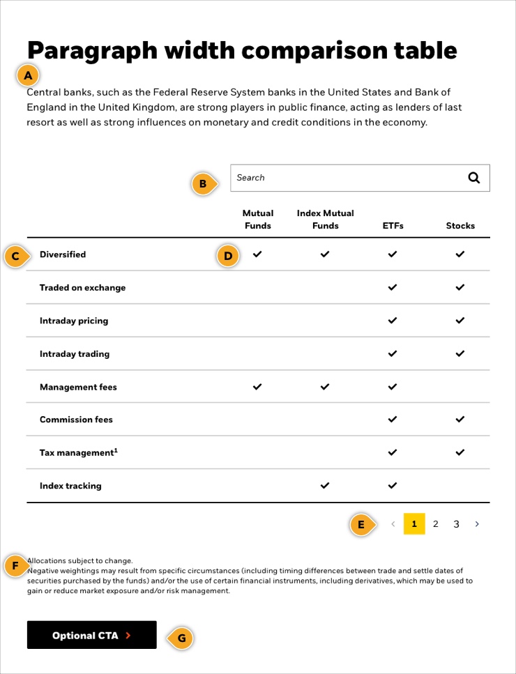
Paragraph width comparison table
Central banks, such as the Federal Reserve System banks in the United States and Bank of England in the United Kingdom, are strong players in public finance, acting as lenders of last resort as well as strong influences on monetary and credit conditions in the economy.
| Mutual Funds | Index Mutual Funds | ETFs | Stocks | |
|---|---|---|---|---|
| Diversified | Yes | Yes | Yes | Yes |
| Traded on exchange | No | No | Yes | Yes |
| Intraday pricing | No | No | Yes | Yes |
| Intraday trading | No | No | Yes | Yes |
| Management fees | Yes | Yes | Yes | |
| Commission fees | No | No | Yes | Yes |
| Tax management1 | No | No | Yes | Yes |
| Index tracking | No | Yes | Yes |
Rules and recommendations

Usage:
- The Paragraph width appearance should be used for tables with 5 columns or less.
- The Full width appearance should be used for tables with 6 columns or more.
| Component element | Optional element | Rules | ||
|---|---|---|---|---|
| A: Main headline + intro |
|
|||
| B: Search |
|
|||
| C: Table |
|
|||
| D: Available FontAwesome icons |
|
|||
| E: Pagination |
|
|||
| F: Source/Caption |
|
|||
| G: CTA |
|
|||
| *NOTE: Due to varying alphabets and character widths, please ensure your publisher tests this prior to release | ||||
Alternate version- Full-width comparison table
Central banks, such as the Federal Reserve System banks in the United States and Bank of England in the United Kingdom, are strong players in public finance, acting as lenders of last resort as well as strong influences on monetary and credit conditions in the economy.
| Mutual Funds | Index Mutual Funds | iBond ETFs | Individual bonds | Bond ETFs | Stocks | |
|---|---|---|---|---|---|---|
| Diversified | ||||||
| Traded on exchange | ||||||
| Index tracking |
Allocations subject to change.
Negative weightings may result from specific circumstances (including timing differences between trade and settle dates of securities purchased by the funds) and/or the use of certain financial instruments, including derivatives, which may be used to gain or reduce market exposure and/or risk management.